Viewrail
Error Prevention

After conducting a comprehensive UX audit of the largest internal application at Viewrail, I found that common problems users face are related to error prevention.
As the lead designer, I aimed to improve the user experience by focusing on finding solutions for preventing wasted time on error handling.
This project is set to start development in 2026.
Year
2025
Client
Viewrail
The Challenge
As Viewrail continues to grow, so does the problems that users run into day-to-day. Prior to beginning at Viewrail, there was no previous designer that worked on the Terminal application. This means there is no documentation, no consistency, and users were not thought of during the creation of it.
I conducted a comprehensive UX audit to pull out challenges in Terminal and a major problem identified involved error prevention and confirmations.
There are many errors that a user can run into that leads them to frustration, loss of time, and confusion. In turn, this creates heavy problems down the line. This project aims to identify and create solutions for the errors that exist today.
Project Focus
There are two objectives to focus on for this project:
Identify and categorize user errors across Terminal.
Design and validate UX solutions that reduce errors and add more consistency in Terminal.
The six (6) main errors that were identified from the audit:
No Confirmations before Important Actions
Users can trigger high-impact actions with one click, making mistakes easy.
No Error or Status Messages
Many actions give no feedback, leaving users unsure if something worked or failed.
Real-Time Data Validation
Users often don’t know something is incorrect until after they try to submit it. Even then, they are confused as to what happened.
Rigid Exact-Match Requirements for Search
Search only works with perfect, exact matches, which slows users down.
Inconsistent Ways of Editing
Editing works differently across pages, making it hard to know what’s editable and how to edit it.
Outdated Data isn’t Clear
Some information looks current or available even when it isn’t, leading to problems down the line in production.
Approach
Most research was previously done in the UX audit and a survey, so I focused time on defining exact issues and requirements, as well as prepping the problem space in order to begin ideation. I created user flows, user stories, and mapped out of all scenarios that exist within the errors.

User Flows
User flows allowed me to find areas of opportunity and pain points.
User Stories
User stories were created from “How Might We” statements for writing requirements.

Mapping Out Scenarios
I mapped out where errors occur by doing a deep analysis from various roles and permissions.
The Outcome
After identifying the highest-risk areas where mistakes were happening, I focused on designing simple, predictable patterns that help users avoid errors before they happen. The goal was to make it painfully obvious when there is an error and if possible, lead the user toward a solution.
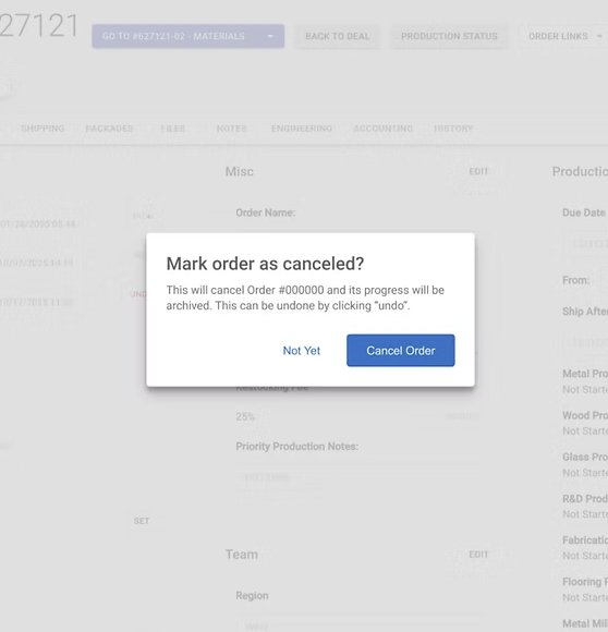
Error 1:
Confirmations Before & After Important Actions
Users take high-impact actions (like adjusting money or putting an order on hold) without any confirmation steps frequently, making accidental clicks easy and hard to catch.
Mistakes often go unnoticed until it’s too late, leading to rework, data fixes, and major workflow disruptions.
Solution: Added lightweight confirmation dialogs for these actions so users can review details and clearly confirm before proceeding.

Example confirmations created for deleting and adding discounts on an order.
Error 2:
No Error Messages and Status Messages
Users often don’t receive any feedback after completing an action, leaving them unsure whether something saved, failed, or updated correctly.
The lack of clear messages creates confusion and slows down workflows, since users repeat actions or rely on guesswork to confirm system behavior.
Solution: Added clear success and error messages so users always understand what happened and what to do next.

Examples of an error message (bottom) and a success message (top). By viewing details, users are prompted with how to fix their error.
Error 3:
Real-Time Data Validation
Users don’t get immediate feedback when they type something incorrectly, leading to confusion, dead ends, and repeated searching to figure out what went wrong.
Invalid inputs often surface only after submission, or never, making errors harder to catch and reducing trust in the system.
Solution: Introduced real-time validation with clear indicators (green check for valid, red icon for errors) so users know exactly what to fix before moving forward.
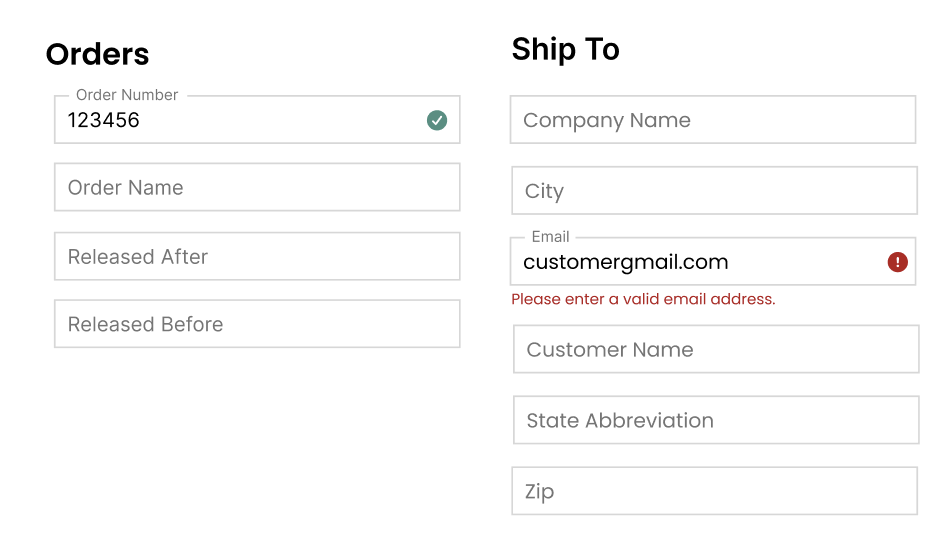
Showing examples of valid and invalid searches. After the user completes typing, the system will give them validation.
Error 4:
Rigid Exact-Match Requirements for Search
Search often fails unless users type the exact item name, causing constant friction and forcing them to sift through long, overwhelming lists just to find what they need.
Users experience this issue daily, leading to wasted time, high cognitive load, and repetitive trial-and-error searching.
Solution: Implemented autosuggest so users can quickly select from top suggestions without scrolling, guessing, or typing perfect matches.
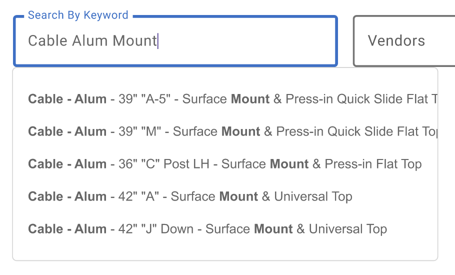
As the user types, the system will pull the top matching results and bolds the words searched.
Error 5:
Editing Inconsistencies
Editing works differently across the application, with some pages using a pencil icon and others requiring users to remember to double-click, which creates confusion and slows people down.
There’s no clear, unified pattern for entering edit mode, making it hard for users to know what’s editable and how to interact with tables.
Solution: Added a consistent pencil-icon-on-hover pattern so users can easily spot how to edit without cluttering the screen and keep interactions predictable across pages.
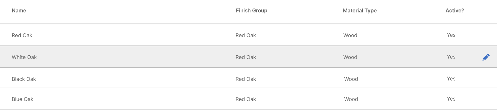
When a user hovers over a row, they are able to view and click an edit icon at the end of the row.
Error 6:
Deprecated Data and Products
Users can’t easily tell whether a product is active or inactive, which leads to mistakes that can disrupt production or shipping later on.
Outdated items still appear in searches and drop-downs, making it easy for someone to accidentally select the wrong product.
Solution: Added a default “show active only” toggle so inactive items stay hidden unless intentionally viewed, reducing errors without removing important historical data.
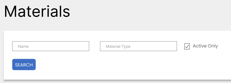
By making a very small adjustment of keeping this checkbox clicked automatically, users should not see unavailable products.
Next Steps
The next phase focuses on implementation and making sure it is implemented in all the right areas of the application. For me, the next step is to partner closely with developers as implementation begins. This collaboration will be key to making sure it's maintainable and working effectively for users.
My Role
As the lead designer in Terminal, my primary responsibilities were to complete the UX Design process for this project and use UX best practices in order to come up with solutions. By working on my own, I was able to challenge myself and explore opportunities within this space before bringing it back to the UX team.