Viewrail
Design System
A first-ever and unified design system built to streamline UX, reduce inconsistencies, and improve development efficiency across all internal and customer-facing tools.
This project is set to start development in 2026.
Year
2025
Client
Viewrail
The Challenge
As Viewrail’s internal tools grew across all internal teams, each team designed UIs independently. Without shared patterns or documentation, components were being rebuilt differently across tools, leading to:
inconsistent spacing, colors, and interaction states
duplicated components built in multiple ways
accessibility gaps
varied error-prevention patterns
to name a few examples. I used my audit of three internal applications I have worked on as the lens into the current inconsistencies.
There are two objectives to focus on for this project:
Create standard elements and components for the first-ever design system.
Establish a scalable, accessible design system used across Viewrail’s tools and portals.
Project Focus
Approach
I began by auditing my main application, Terminal’s existing UI patterns, along with the two other tools, to uncover inconsistencies that were also surfacing in both external and internal tools. This helped the UX team identify the most reused elements and the areas where we needed clear standards. Below are a few examples.

Example 1: Primary Buttons
All primary buttons used various shades of blue and corner radiuses, however only one shade matches up with our style guide from Marketing.

Example 2: Toast Messages
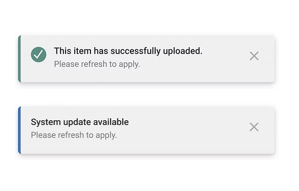
We found that toast messages were inconsistent in their icon usage, style, and color.
Example 3: Search Bar
As important as search is on a page, it looks completely different depending on the tool or application.
What was Created?
To create a unified foundation for all Viewrail tools, I helped formulate and design:
Color tokens optimized for contrast, accessibility, and scalability
Reusable elements for all tools
A spacing system to eliminate ad-hoc padding/margins
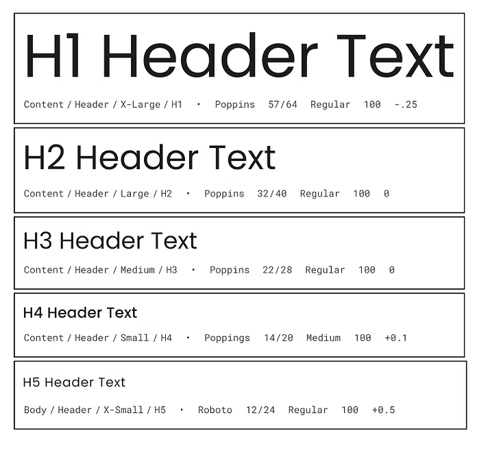
A typography hierarchy that improved clarity in data-heavy screen
Naming conventions aligned with how developers structure and reference components
These foundations established a shared structure across the entire organization and informed the component system that followed.
We intentionally referenced Google’s Material Design system as a foundation, leveraging its proven interaction patterns to reduce cognitive load and create a familiar experience for users.
The Designs
Style Guide Outcomes
This updated style guide is a full refresh of Viewrail’s visual identity, built by our UX team to finally bring everything under one consistent, modern look. The goal was simple: make our tools feel more like “Viewrail” — clean, minimal, architectural, and modern.
We expanded the color system with new hues of our primary blue so teams have options that work across real product scenarios, especially in data-heavy screens. The typography, iconography, and spacing all got tightened up and support a more polished and cohesive experience.
This guide acts as our single source of truth. It helps designers and developers move faster, stay aligned, and build interfaces that feel obvious that it's Viewrail, no matter which tool or department they’re coming from.
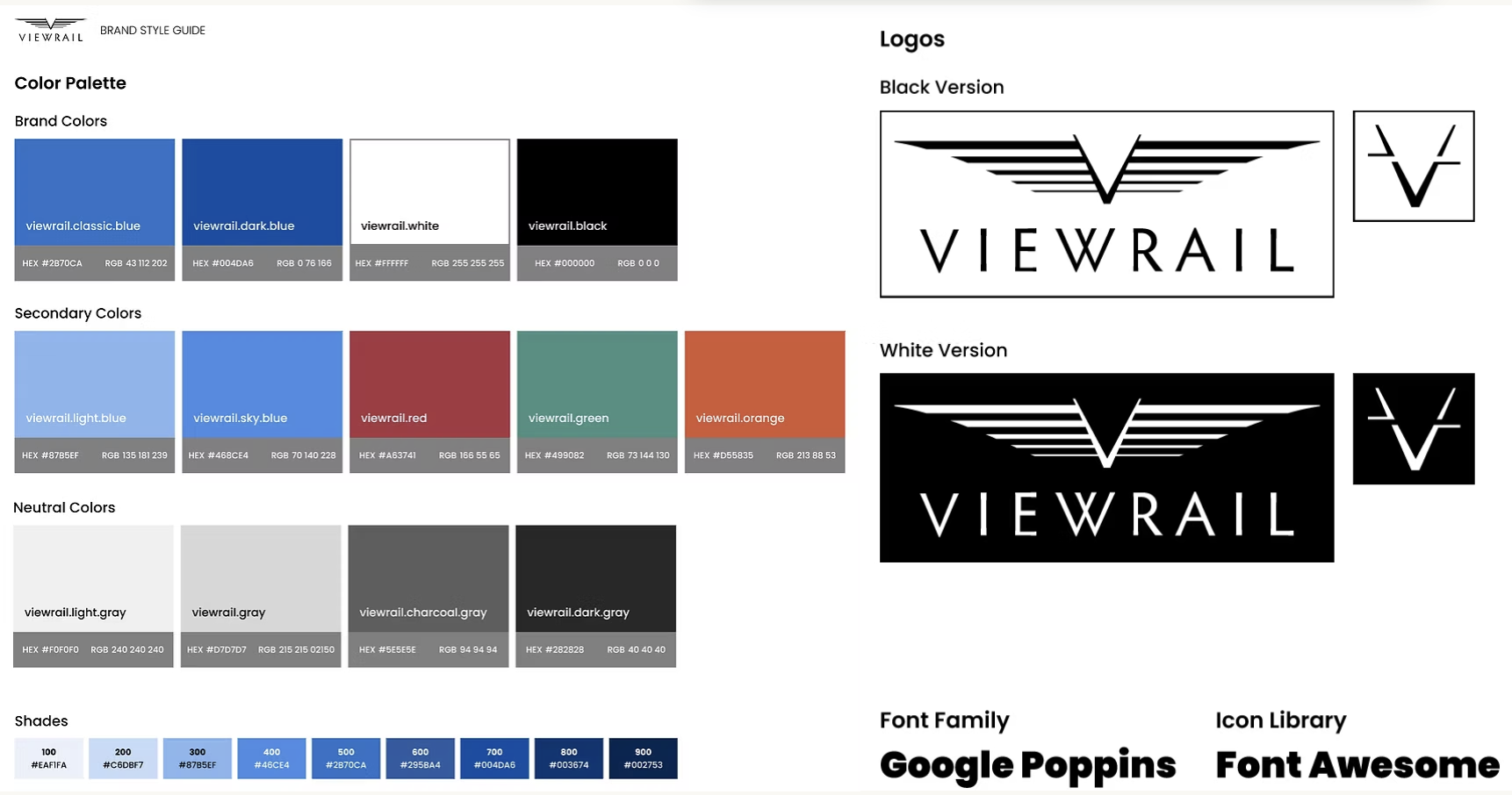
Official updated style guide for Viewrail as of 2025.
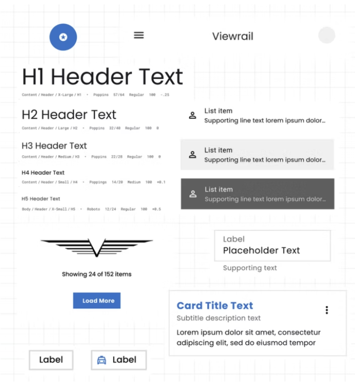
Design System Outcomes
Here are a few examples of the component work behind our updated design system. This isn’t the full library, but a snapshot of the pieces I rebuilt. They are all based on the new foundations: our updated color tokens, spacing system, and interaction states that our UX team created to align with Viewrail’s brand and support all workflows. Keep in mind that more variations were created than what might be shown, like disabled states and dark mode.
Design System: Primary Button
By using our secondary color with our secondary button, we create a button that is clearly different than the primary one. It utilizes the updated style guide colors as well.
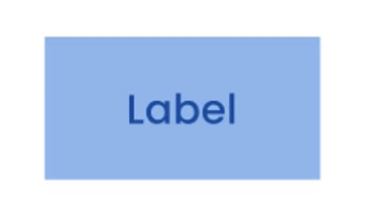
By using our primary color with our primary button, we create a beautiful CTA button that is clear and evident to the user. We adapted rough edges rather than soft ones to mimic the look and feel of stairs and railings.
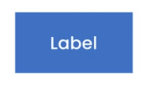
Design System: Secondary Button
Design System: Toast Messages
Designed a simple, reusable tooltip pattern that gives users the extra clarity they need without cluttering the UI. We specifically focused on the sizing and spacing.
Toast messages are used widely, yet used to look different on every tool. This solution appears well on the screen without being too distracting and gives the user the ability to cancel it out quickly, if needed.
Design System: Tooltips
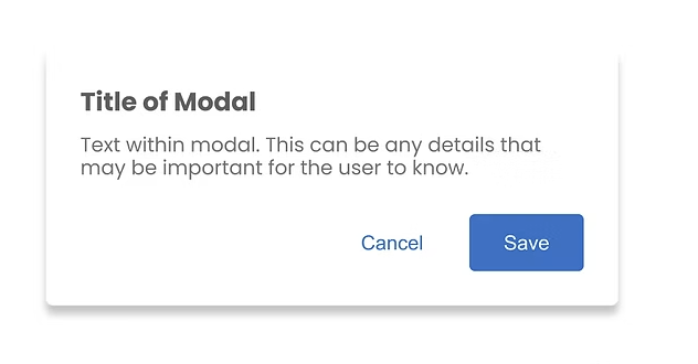
Design System: Modal
We created consistent heading levels and paragraph sizes that adapt to dense data views, form-heavy screens, and long-read content.
Modals were designed to clearly surface important decisions or confirmations, giving users a focused moment to review information before taking action.
Design System: Headings & Paragraphs
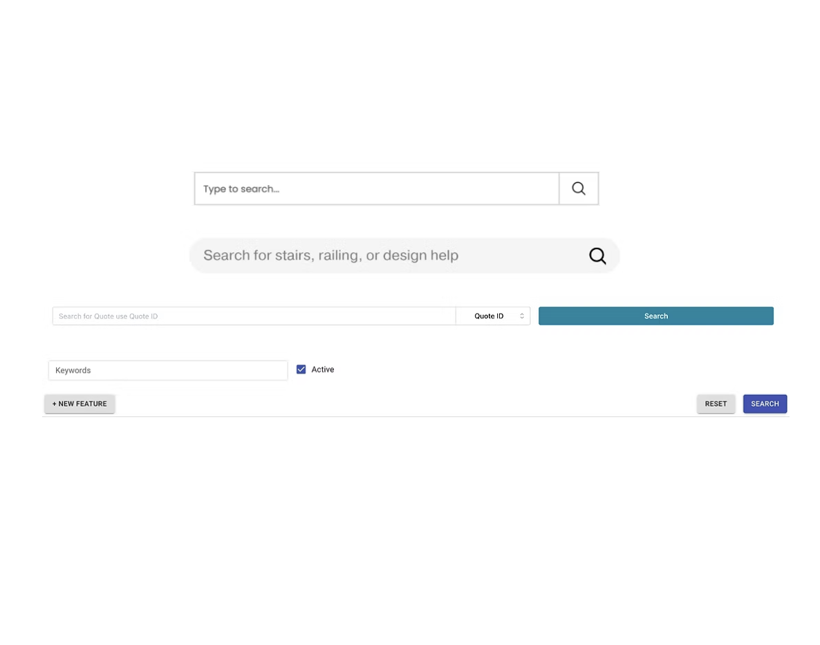
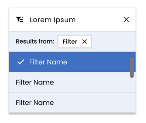
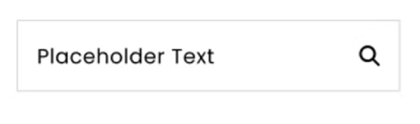
Design System: Search
The advanced search expands on the base pattern while staying visually and functionally consistent with the rest of the system. It gives users more filtering options.
The updated search provides a consistent, predictable experience across tools. It uses a simplified input field and clear placeholder text to help users quickly find what they need without extra buttons or steps.
Design System: Advanced Search
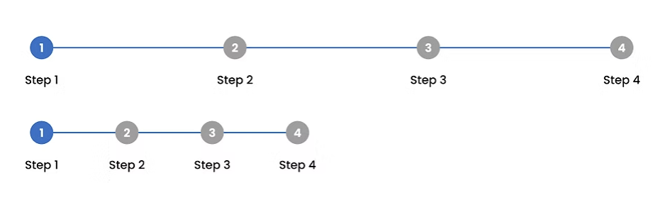
Design System: Stepper
Hero images give a more polished, branded first impression while creating a consistent visual hierarchy across pages that previously felt disconnected. This mostly applies for external tools.

New stepper brings visual clarity to multi-step processes, helping users track their progress and reducing guessing work in tools that previously had no standardized flow.
Design System: Hero Images
Key Improvements
Faster development due to reusable, well-documented components
More consistent UI across all company tools (external and internal)
Clearer design to dev handoff with fewer one-off questions
4. Better accessibility and predictable interaction patterns
5. Stronger foundation for future UX improvements, including error prevention
Next Steps
As the design system grows, the next phase focuses on implementation, supporting more complex workflows, and making the system easier for teams across Viewrail to adopt.
My Role
I worked in a team of 3 UX Designers in order to build this design system from scratch. I was mentored to learn how to create components for design systems and the implementation of those as well.